The-Art-Center-Title-Bar
space
Showing posts with label Sam Nielson. Show all posts

Sam Nielson: Painter Brushes

Let me start this by saying that you will never get what you want out of your brushes in a digital art program (at least not with current technology).  You'll save yourself a lot of frustration if you accept this fact and learn to be happy with what is available.  Also, I'm not going to do a tutorial on Photoshop brushes because I haven't found anything I love yet (though CS5 might change my mind).  This has nothing to do with program superiority, just preference.
Here are some of my favorite brushes.  Most of these are are out-of-the-box brushes that come default with painter.  Before you try any of these out though, use the "Brush Tracking..." feature in Preferences (edit menu on PC, Apple icon on Mac I think).  Do a few strokes in the box typical of your pressure and speed and it will automatically calibrate Painter's settings to match your drawing style.  If you don't do this you may not like the "feel" of a lot of these brushes.

I'll start with the brushes I like to draw with:
The markers make ugly, soft, messy-looking drawings, but they're great for roughing things in, especially because of the way the marker strokes build on top of each other.
I use the round tip pens for inking, but I changed the Minimum Size of the brush to zero so I could have lots of scale variation.  If you make these brushes very big you lose a lot of control.
The charcoal is the closest I've found to pencil if I'm touching up a pencil drawing I scanned in.
The Liquid Ink looks great but is a bit hard to control, especially when the brush size is small.

Next up, my favorite cover brushes.  These brushes have little or no bleed, so it's easy to get fully saturated color:
"Custom 1" (settings below) is essentially an airbrush with the tip changed to something a little harder.  What's nice about this brush is you can use it for soft falloffs like you would with an airbrush, but if you want to get a heavy stroke with a fairly defined edge you just dig into the pressure a bit.  It sometimes has strange artifacts when using on layers of different types (like Gel).
The captured acrylic is my most used brush. I like the combination of the cover style of the brush with just a touch of bleed.  The only problem is it goes very slow if you make the brush very large, so use something else for your large strokes.
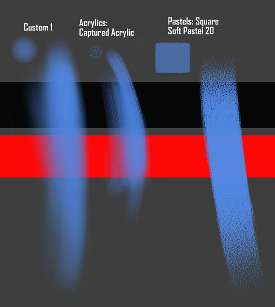
I don't use the square pastel often but it's a great brush if you want heavy texture in your strokes.  I often use the fade tool (Ctrl+Shift+F) to get lighter strokes since it's at full opacity.

My favorite "painterly" brushes have heavy blending at low pressure and apply color at high pressure:
I don't particularly like the Smeary Round but I included it because a lot of people I know do like it.  I never got very good at oil painting and it feels a lot like oil painting to me: everything just smears together.  I bet you could get great results with it if you were patient.
Custom 2 (settings below) is a very digital-looking painterly brush, but it gives such smooth yet slightly varied results that it can be really appealing when used correctly.  This is very similar to the brush Ryan Wood uses and until a couple years ago was one of my most-used brushes.
The Loaded Palette Knife is a lot of fun and gives a lot of texture and direction to your strokes.  The only change I made to this brush was setting the Angle of the brush to the "Bearing" of my pen.  This only works with Intuos pens.
Custom 3 (settings below) is about halfway between the palette knife and Custom 2.  I haven't used this one much lately but it's a great brush (I'd forgotten, but this tutorial reminded me) and I think I'll try to use it more often.

There are two other brushes I occasionally use:
The Glow Brush is great for glowing things.  Don't overuse it because it starts to look like cheap trickery pretty fast.
The Digital Watercolors are really nice for initially applying color over drawings.  I know Painter has some super-advanced watercolors now, but the old digital watercolors are faster and more approachable.  Just remember "Dry Digital Watercolor" in the Layers menu when you're ready to paint on top of them.

One final note:  Even the best brushes won't make you a better artist.  What brushes can do for you:
1-Speed up your process of applying and mixing color
2-Add visual interest with your brush strokes and layering of strokes
However, I've found that 1 and 2 don't usually go well together.  In fact, usually the more interesting a brush looks, the harder it is to paint with and vice-versa.  So adjust your expectations accordingly: if you prefer quick and easy-to-use brushes like me, don't be terribly surprised when your final results look like the digital airbrush job on some guy's truck.  Or, like me, you can just accept the cheapness of the results and be happy with the extra time you have because of it.  But if you really want things to look great, you need a lot of patience.

Bookmark and Share

Sam Nielson: Another painting process-adding color to grayscale

I know a lot of people who like to paint their values first in black and white and then apply color to their values.  I've never found an ideal way of doing this, but I've learned a couple tips that help it work out a little better.
First off, I don't let any of the values get too dark, except where I want things to drop completely into shadow (ie. black)  In this case, I lightened the "grayscale" image before applying any color to it.  You can see the original values I painted on my blog.  I usually don't spend a ton of time working detail into the values because I often have to paint in all that detail again when I get to the colors.
Then, I use a multiply or gel layer to control values.  The "Color" or "Colorize" layer types often result in values different than what I intended.  Painting a "Gel" or "Multiply" layer with bright colors will gives a similar result, but I like the option of bringing the values down where things aren't working out.  This is what the layer looks like when it's over a white canvas (or a white layer between the canvas and the color layer, that way I can just change visibility if I need to pick colors off the canvas).  Notice that I put in color changes from light to shadow; otherwise, the image looks like you've colorized a grayscale image because all the light has a uniform color.
This is what the image looks like with the colors applied over the values.  I usually only take this coloring step so far---it's useful for blocking in big colors and even playing with the values a little, but once it's looking pretty good I collapse the image so I don't have to wrestle with the layers anymore.
Now that the image is flattened, I use a "Screen" layer to put in light reflections and a "Lighten" layer to add some sub-surface scattering.  Then I collapse again and use a small brush to paint in all the details.
So when should you use this method?  Sometimes it's easier to handle the values separately from the colors, especially when your lighting is fairly simple but you've got a difficult composition.  Another time it's useful is if you want patterns or value changes across a surface without messing up the values (painting these things across a lit surface can be a pain to figure out).

The reason I don't often use it is the pain of dealing with the value shifts when colorizing.  If I already spent a lot of time working out the values, I don't want to work all that out again.  If the values are very detailed I sometimes feel like I'm painting the whole thing twice.  However, this process suits some people's patience and way of thinking so hopefully it's worth sharing anyway.

Bookmark and Share

Sam Nielson: Painting Process, Part 2

At the end of my last post I said I'd describe the polishing phase in another post.
The polishing phase of your painting should be focused on resolving two questions:
- How will the viewer to respond to the subject?
- Where do I want the viewer's eyes to go?

The first question should be already answered in part, because once you've decided your light and color scheme you've already set some of the emotional content of your picture.  However, you can do things at this point to "plus" the emotions or ideas in your image.  Here's what he looked like in the last post:
My original idea was a grumpy Jedi---a character whose traditional role is civilized and restrained, but who is irritated nearly to the breaking point.  I lost the Jedi when re-drawing him, but I still want to communicate that he's dangerous and he's about ready to snap.  I don't feel like I'm hitting that note with the lighting, but I don't want to start over.
Having an image with the lighting effects in layers is really helpful at this point, because changing where the shadows fall is as simple as erasing part of a layer.  So I use a shadow over his eyes to get that film noir effect that makes him mysterious and dangerous without changing anything else about him.
Now is the crucial point of decision, where you can spend countless hours on things that don't matter if you're not careful.  So usually at this point I create a mental "heat map" of where my eyes move in the image.  I do this by sitting back and imagining that I'm seeing the image for the first time, and I pay attention to where my eyes go naturally.  Then, I mentally work out where I want my eyes to go instead.  This image shows the scribbly path my eyes follow at first, but also a more controlled, hotter path representing the way I'd like things to go.  A simple path or shape is the best!
At this point I flatten my image, because my process starts to become so chaotic.  For me layers are useful for laying the foundation but after that they're just a hindrance, unless I create them as need arises and then flatten everything soon after. 
So as I was saying, my process seems chaotic from here on, but it's not; because I'm using that heat map to help me prioritize my work and to dictate the highest points of contrast in the image.  The hottest area on my heat map is the face and the eyes, so that's where I start putting in detail.  I also darken the top of the head to create a frame and lower contrast around the eyes.  This will help them stand out even though they're in shadow.
Next priority is the hands.  People always notice the hands, especially in this case because they're part of the compositional path, so they need to look good.  I start filling in other details around the hands like the reflection in the liquid, because even though most eyes will follow the compositional path, giving the eyes something to explore in the "rest" areas makes your image feel rich and alive.  I also boost the contrast levels a little to deepen the shadows.
More detail and composition adjustments.  I pull out the blues in the dust cloud behind him to add contrast to that edge, but I'm careful to keep it subdued because this is a secondary path in the composition and not the primary one.  I also brighten the eyes a tiny bit so they stand out more.
Now the finishing touches.  I add a faint reflection to the tabletop, adjust the clouds a bit, and finish up the detail on his sippy cup (was originally supposed to be a futuristic mug, but whatever).  I decrease the contrast around his eyes a little and then put in some subtle edges of color along the compositional path for visual interest.
As I was writing this post I realized I hadn't done enough to suggest his danger (since he's not a Jedi now), so I went back and put in a couple scars and some wear in his clothing.  I'm not sure about those details yet, but that's why I usually wait a day or so before calling something done---because you sometimes make decisions that seem good at the time and later wonder what you were thinking.  Or at least I do.

Bookmark and Share

Sam Nielson: Painting Process

Someone asked a question about the process of painting a character, so I'll take a stab at that one.  There are many processes that each have their strengths, but for the sake of learning this is what I'd suggest.  This process is based around the way 3d rendering programs work, using separate passes and combining them together for the final effect.  Separating the processes in this way helps you think through what needs to be done.

First of all, start with a sketch.  Don't try to design a character as you paint, unless you are really advanced and probably not even then.  Inked line art is fine.
Pick up the lines as a layer, and switch the layer type to multiply or Gel if you're in Painter.  Turn the opacity way down so the lines aren't getting in the way of what you're doing.

These next steps can almost be done in any order.  On a background layer put in flat colors, like you would if you were painting an animation cel.  Keep the values fairly dark and even---even white surfaces should be a medium gray at this point.  I'll usually have a color scheme in mind; in this case I used an analogous scheme (red/orange/yellow/brown)contrasted against a single "compliment" (the blue).

On a separate layer, paint the occlusion in.  I'll talk more about occlusion some other time, but basically think of the cracks where the ambient light of the scene can't easily bounce into.  I put a white background in so you could see it better.  Don't be too heavy-handed or feel like you have to render out the entire scene this way!
Now, on a new layer, paint in a single light source.  If this is a basic character rendering you probably want this lighting to be fairly neutral in color, but a simple warm/cool lighting scheme should be fine.  I often start with hard edges on everything, like a cel-shaded image, and then I soften the edges where the form curves or I fade out any planes that are trending toward the terminator (I talked about this in another post).  I painted in the lit areas with white but switched the layer type to "Overlay" so it would keep my colors.
Here is what the lighting layer and the occlusion layer look like when they're both visible on a blank background.  See how sculptural it looks already?
Here's what those layers look like applied over the colors I painted earlier:
If you want any more lights in the scene, use a "Screen" layer, which acts as a true additive layer.  And you can use other layers to tinker with the colors and texture in the scene.
Now you have a fairly good start to your painting and you're ready for the polishing phase.  I'll save that part for another post though, later.

Bookmark and Share

Sam: Lights and Shadow

Shadow comes in two forms, form shadows and cast shadows.  I talked about form shadowing in my last post, referring to the way light darkens around the form and finally terminates when the forms turn away from the light.  That's a simple explanation, but the location of the terminus and the way the light falls off depends heavily on the light source.

Cast shadows are caused because photons striking one object (and being absorbed or deflected) necessarily can't pass through that object.  So if you can trace a line through space from the light source to the edges of the object, you'll know exactly the shape of the shadow being cast onto objects behind it.  Again, that's an overly simple explanation because like form shadows, cast shadows depend a lot on the light source.

So let's look at how light sources affect form shadows and cast shadows.  For most lighting schemes, you will use one of three light types: Spotlights or distant sources, nearby sources, and large or diffuse sources.

Spotlights, Sunlight, and Distant Sources
These lights give you soft-edged form shadows but hard-edged cast shadows, because the photons are essentially flying parallel because of the distance from the source.  Remember to think in three dimensions to work out where the shadows fall!


Nearby Sources
As light sources approach an object, the cast shadow grows in size and the terminator approaches the light source (to the point where the planes on the object are parallel to the photons travelling from the light).  Remember that any other objects around the light will have a different center light location and terminator.  If the light source is small then the cast shadow will be hard-edged.  This is the hardest light source to paint!


Large or Diffuse Sources:
The larger the light source is (relative to the object) the more the terminator moves away from the light source and the softer-edged the shadow becomes. This is because A) light radiates in every direction from everywhere on the source and B) only portions of the light source are effective as you approach the area behind the object, since the object is blocking photons from getting through to that area.


Finally, remember that cast shadows aren't black---they're filled with light from the rest of the environment.  Sometimes in complex lighting situations, I figure out what the object looks like under the main light source before I paint in the main source, and that helps my cast shadows feel more true to the scene.

Bookmark and Share

Sam: Lambertian Reflection

A lot of aspiring painters have a hard time with accurate rendering, whether painting from life or just out of their head.  So my first few posts will address some key properties of light and surface.
Some people seem to get this stuff intuitively.  I'm not one of those people, so I often have to figure things out.  One thing I've found that helps is working like a 3-d rendering program: thinking 3-dimensionally, rendering effects in passes, and in general isolating problems to deal with them separately.

So let's start with Lambertian Reflection, which is when a surface reflects light in a way that each part of the surface looks the same from every angle.
I purposefully used an ambiguous shape here, because what's important about this way of thinking is that you can solve literally any form in this way.  In the next few posts, I'll talk about different light sources, and then how this line of thinking applies to shadows and reflections.

Bookmark and Share