Leighton Hickman: An Introduction to Plein Air Landscape Painting
The greatest challenge for anyone new to painting en plein air (in open air) is distilling the overwhelming visual information of the landscape into a painting. The key to this is simplifying and grouping objects into a manageable framework that can then be added to, refined and detailed. In this post I've included an exercise from my landscape painting class as well as a step-by-step series of photographs from one of my personal plein air paintings explaining how the exercise applies to creating a finished piece.
The first exercise I have my students do is to construct a composition using white and burnt umber in a five value scale. In this exercise burnt umber will serve as our darkest value and white as our brightest with three steps in between. The goal here is to challenge yourself to create a simple graphic composition using a limited value structure while still remaining true to landscape you're trying to depict.
Before I begin any painting from life I like to take a moment to name the colors and values of the objects I will be painting. This helps me to create a plan before I start applying paint to canvas and helps limit any mistakes and frustrations that arise from beginning too hastily.
I picked this view specifically to give more leverage to my limited value structure. The overlapping levels of lights and darks not only add visual interest to the painting but also act as depth cues separating foreground from middle-ground from background.
The sun, your light source, is always moving when you're painting outside so use your time wisely and try not to be too precious with your drawing. Establish your lights and darks immediately to avoid confusion later as your light source moves overhead. Never try to chase the sun while you paint- instead start your painting with an established light source and stick to it. This will save you from hours of frustration.
First, I lay in my composition by doing a loose sketch. I then begin painting with my middle values saving my darkest darks and lightest lights until the end so that I have more room to adjust contrasts. It's often wise to leave your sky blank when painting outdoors because it's generally your lightest value and if you try establishing it too soon you'll often paint it too dark.
Once my middle values are established I pop in highlights and add my darkest darks at contact points and overhangs. Be careful not to break the value structure you established in the beginning of your painting- the goal here is to sweeten the composition with just a few touches in carefully chosen locations to keep the values from becoming spotty. I often try to centralize the highest levels of tonal contrast to my focal point in order to add to it's visual interest.
While the goal here isn't to create an art piece this exercise is a great introduction to building a composition and has direct applications to creating a finished piece. Below is a step-by-step plein air cityscape I painted using the same concepts from the exercise above.
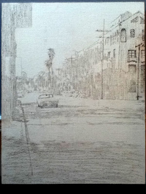
Before painting I established the composition's figure ground relationship and defined the areas of light and shadow in a pencil drawing.
I began the painting process by applying the middle tones to the areas in shadow using heavily diluted paint.
To create the stylized, vintage and atmospheric look I used a series of monochromatic washes, adjusting my values by adding or wiping away paint. At this point I'm leaving the areas of highest value white much like I left the sky white in the exercise above.
Its not until I begin to address the lights that I abandoned my atmospheric washes for thicker paint and sharper edges. This was done to create stronger visual contrast between the areas in light and those in shadow, further allowing them to blend and recede. I kept my lights limited to hues complimentary to the shadows using only blues and greens to create a sharp contrast between the reds and oranges of the shadows. The highest chromatic and value contrasts are reserved for the focal point: a blue vintage sedan.
Here is the finished piece, stylistically very different from the exercise we started with but conceptually they are one in the same.
A view of the street and my set-up. The light has changed dramatically at this point but this is why I established my value structure early on. Hope this inspires some of you to move your studios outside for a bit and try your hand at some plein air- happy painting!
-Leighton Hickman
Eaton Canyon demo photography courtesy of Fred Palacio http://fredpalacioart.blogspot.com/
Subscribe to:
Post Comments (Atom)


5 comments:
Great demo Leighton!
Beautiful post!!
Superb! That was awesome tutorial I got there. Interesting styles, I look forward for another post. :D
buy aion accounts
Thanks guys- look for more tutorials in the near future!
So informative Leighton! Thank you very much for sharing... I need to come out and paint with you soon! -J
Post a Comment